At the Smithsonian

Quick note that a two-part piece of mine has been published at the Smithsonian Museum’s Collections blog. It’s called “Southwest Archaeology and ‘The Time of Vietnam’” – here’s part two. The post is about an archaeologist studying pueblos in Arizona who got help from the US military to photograph some sites during U2 training flights in the desert. It’s an interesting story, and one that has echoes of both the ties between the military and research of indigenous peoples and the connections between war and photography. The photographs are part of the National Anthropological Archives at the Smithsonian National Museum of Natural History. Here’s a little excerpt:

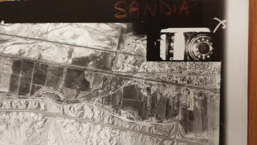
[One] thing that each photo shares is the mark of a small accessory attached to the camera: in the bottom-right corner, each image has a clock and a counter marking the time and number of the snapshot. Some visual anthropologists have analyzed not just the photographic image itself, but also the “micro-event of the making of the photograph” (Pinney 2012). The counter and clock here are such a “micro-event,” but they are also more: they are part of a whole apparatus that took and collected photographs of much of the world.

While I spent several hours following the roads and mountain ranges of the Zubrow photos, I was drawn mostly to the clocks and counters. I tried to decipher the numbers jotted alongside the counter and across the face of the clock. I got lost in making a chart and reorganizing images by time and by number (the photos are not dated, only time-stamped, and the collection is arranged alphabetically by pueblo name). I found myself wondering what images filled the gaps, and where the planes traveled when they weren’t photographing the American Southwest.

figure2b5

Check out the whole thing at the links above. The post and the research that went into it were part of Josh Bell’s Visual Anthropology course, which I took last year and which included a couple of visits to the NAA. Big thanks to Josh and to Caitlyn Haynes and Gina Rappaport of the NAA for their help.

Advertisement

Maps and the Way We See Africa

A friend recently showed me a post at HuffPo’s Impact blog titled “8 Maps That Will Change the Way You Look at Africa.” Curated by an intern at The ONE Campaign, the short listicle includes eight maps that, well, don’t change the way anyone has looked at Africa in the past century.

In numerical order, this list allows one to look at Africa as 1) the place where most of the world’s poorest live; 2) the least wealth continent; 3) huge; 4) including a number of the few countries that still have slavery; 5) having an arid North and lush agricultural sub-Saharan region; 6) at high risk for water scarcity, especially in the northern and southern ends of the continent; 7) way behind (but growing!) in internet access; and 8) having little access to electricity.

The list was posted earlier this month, and I’m not the first to comment on it. So, rather than rant too much about how we don’t need to keep talking about Africa as a place of poverty and landscape (and I am glad there wasn’t a map of conflict), I’m going to post some maps that are also worth looking at below the fold. I know that there are others that have given me pause for thought, though I haven’t been able to track them down. Anybody have maps that influenced how they view Africa or parts of Africa?

Continue reading

Facebook Friendships Across Borders

In an effort to totally not do what I should be doing (reading, writing), I’ve been playing with this interactive Mapping the World’s Friendships map from Facebook Stories. The map shows Facebook relationships between people based on their listed country, highlighting the top country-wide connections. Clicking on various countries, there are some downright unexpected connections. From the article that follows the map:

[A]s we did a little research, some unusual connections become surprisingly clear. We learned that immigration between Japan and Brazil dates back to the 1970s, that Poles are the largest immigrant group in Iceland, and that more people commute across the border each day to work in Liechtenstein than Liechtensteiner locals going to work in their own country.

Immigration is one of the strongest links that seems to bind these Facebook neighbors, as thousands of people pour over borders or over seas, seeking jobs or fleeing violence, and making new connections and maintaining old friendships along the way. Economic links, through trade or investment, also seem to be strong predictors of country connectedness. And finally, one of the most overwhelming trends we found as we explored this graphic is the strong tie that remains between nations and their former colonizers, whose continued linguistic, cultural, and economic ties still echo today.

It’s worth clicking around and looking for the weird relationships, like the fact that Zambia’s top five connections are all its neighbors, but the Democratic Republic of the Congo’s top five are neighbors like Uganda and Zambia, Anglophone West Africans Ghana and Nigeria, and…. Ecuador. Relatedly, the DRC is the second on the list of connections if you click on Brazil. Meanwhile, Central African Republic’s top five include only one African country (neighboring DRC) and then a bunch of Asian countries.

Anyways, you should go play with the map. It raises a lot of questions, and only some answers are easy to come by.

Africa’s Countries

Over at Africa is a Country (very appropriate, I know), Laura J. Mitchell linked to an interactive study map of Africa that she created, saying that:

As Africanists, our stock-in-trade includes pushing back. As teachers, scholars, and commentators we poke and prod at constructed geographies, charting unities across previously demarcated sub-regions and identifying particularities in eco-zones or communities that are conventionally grouped with larger nations. In a post-modern landscape, geography is admittedly malleable. But that does not make it optional. I may be hopelessly old-school to say so: but to make sense of a place, you still have to find it on a map.”

The map, which can be found here, is a pretty straight-forward geography study tool. You can hover over each country in study mode to learn which is which, and you can test yourself by dragging country names over the geographic location.

Whether you’re a student trying to learn about Africa’s many states or just a curious geography nerd, it’s worth a look.

(Shameful admission: I still mix up the western coast of West Africa.)